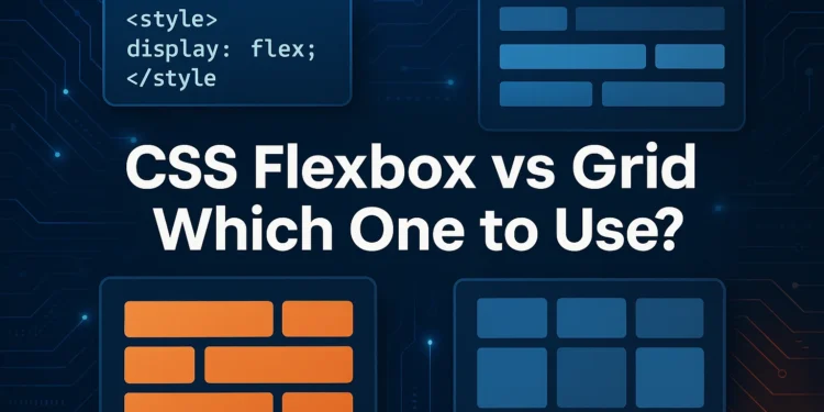
CSS Flexbox vs Grid: Which One to Use?

If you’ve dipped your toes into modern web design, you’ve probably come across Flexbox and CSS Grid. Both are powerful layout tools that help developers move beyond the limitations of traditional floats and tables. But here’s the million-dollar question: which one should you use?
- In this guide, we’ll break down:
- What Flexbox and Grid are.
- The differences between them.
- Real-world examples for USA/UK audiences.
- Best practices for choosing the right one.
- FAQs to help clear up confusion.
Let’s dive in.
1. Quick Refresher: What Are Flexbox and Grid?
CSS Flexbox (Flexible Box Layout)
- Introduced to simplify one-dimensional layouts (rows or columns).
- Best for aligning and distributing items inside a container.
- Example: Navigation menus, product cards, or toolbars.
A simple Flexbox example
css
.container {
display: flex;
justify-content: space-between;
align-items: center;
}
CSS Grid Layout
- Built for two-dimensional layouts (rows AND columns).
- Perfect for page structures, dashboards, or galleries.
- Offers more control over large-scale designs.
A simple Grid example:
css

.container {

 display: grid;

 grid-template-columns: 1fr 1fr 1fr;

  gap: 20px;

}
Both are part of modern CSS3 specifications and are widely supported in USA/UK browsers (Can I Use , MDN Docs).
2. Flexbox vs Grid: The Core Difference
| Feature | Flexbox | Grid |
|---|---|---|
| Layout Type | 1D (row or column) | 2D (rows and columns) |
| Best For | Small components, nav bars, cards | Page layouts, complex grids |
| Alignment | Powerful item alignment | Explicit control of structure |
| Learning Curve | Easier for beginners | Slightly steeper |
| Browser Support | Widely supported | Widely supported (modern browsers) |
Rule of thumb:
- Use Flexbox when working with a single dimension.
- Use Grid when structuring the entire page or large layouts.
3. Real-Life Use Cases (USA/UK Context)
When to Use Flexbox
- Navigation bars (US e-commerce sites like Amazon or UK news sites like BBC).
- Form controls (aligning labels and input fields).
- Simple responsive layouts (cards, buttons, menus).
Example: Aligning a UK government service form with Flexbox:
css
.form {
display: flex;
flex-direction: column;
gap: 10px;
}
When to Use Grid
- News site layouts (e.g., Guardian UK, New York Times US).
- E-commerce product pages (US retailers with product grids).
- Dashboards (finance or analytics platforms).
Example: A 3-column news layout with Grid:
css
.layout {
display: grid;
grid-template-columns: 2fr 1fr 1fr;
gap: 20px;
}
4. Combining Flexbox and Grid
The truth? You don’t always have to choose one over the other.
Modern developers in the USA and UK often combine both:
- Use Grid for the overall page layout.
- Use Flexbox for smaller components inside grid items.
Example:
css
.page {
display: grid;
grid-template-columns: 1fr 3fr;
}
.nav {
display: flex;
flex-direction: column;
}
This hybrid approach is especially common in responsive websites, where Grid handles structure and Flexbox refines the details.
5. Accessibility & Compliance (USA/UK)
In the US and UK, web accessibility laws (ADA in the US, Equality Act in the UK) make it crucial to use Flexbox/Grid properly.
Best practices:
- Always use semantic HTML with your layouts.
- Ensure text and controls remain accessible when resized.
- Test layouts with screen readers like NVDA (US) or VoiceOver (UK).
- Internal Resource: Check our Beginner’s Guide to HTML Basics for semantic HTML foundations.
- External Resource: W3C Accessibility Guidelines.
6. SEO Perspective: Flexbox vs Grid
From an SEO standpoint, neither Flexbox nor Grid directly impacts rankings. But how you use them does:
- Responsive Design: Google ranks mobile-friendly sites higher.
- Load Speed: Cleaner CSS → faster pages.
- Semantic Markup: Use
<main>,<article>,<header>with your layout.
Internal Resource: Our Responsive Design Guide covers this in detail.
7. Developer Tools in USA/UK
- Visual Studio Code (Free) – most popular among US/UK developers.
- CodePen.io – great for testing Flexbox/Grid snippets.
- MDN Layout Playground – interactive learning from MDN.
Internal Resource: Explore our Top 10 Free Code Editors for Beginners.
FAQs
Q1: Should I learn Flexbox or Grid first?
Start with Flexbox—it’s simpler and covers most small-scale needs. Move on to Grid for full-page layouts.
Q2: Can I replace Bootstrap with Flexbox/Grid?
Yes—modern sites in the US/UK often skip frameworks like Bootstrap in favor of native CSS layout tools.
Q3: Is browser support reliable?
Yes. Both Flexbox and Grid are supported in all major browsers (Chrome, Firefox, Safari, Edge). Always test in multiple browsers.
Q4: Can I use Flexbox inside Grid?
Absolutely. Many responsive layouts combine Grid for structure and Flexbox for detail alignment.
Q5: Which is better for accessibility in the USA/UK?
Both are fine—just ensure semantic HTML, alt text, and ARIA roles when needed.
Wrapping Up: Flexbox vs Grid — Which One Should You Use?
So, Flexbox vs Grid isn’t a fight—it’s about choosing the right tool for the right job.
- Use Flexbox for one-dimensional layouts (rows or columns).
- Use Grid for two-dimensional layouts (entire pages or sections).
- Combine both for responsive, accessible, and scalable designs.
Next Step: If you’re just starting, try building a simple navigation bar with Flexbox, then move on to a multi-column layout with Grid.
Don’t miss our follow-up guide on CSS Basics and Responsive Web Design.
Explore CSS Tricks Flexbox Guide and CSS Tricks Grid Guide for reference.
With these tools in your belt, you’re well on your way to becoming a Limitless Coding Titan.


